Challenge
Case study
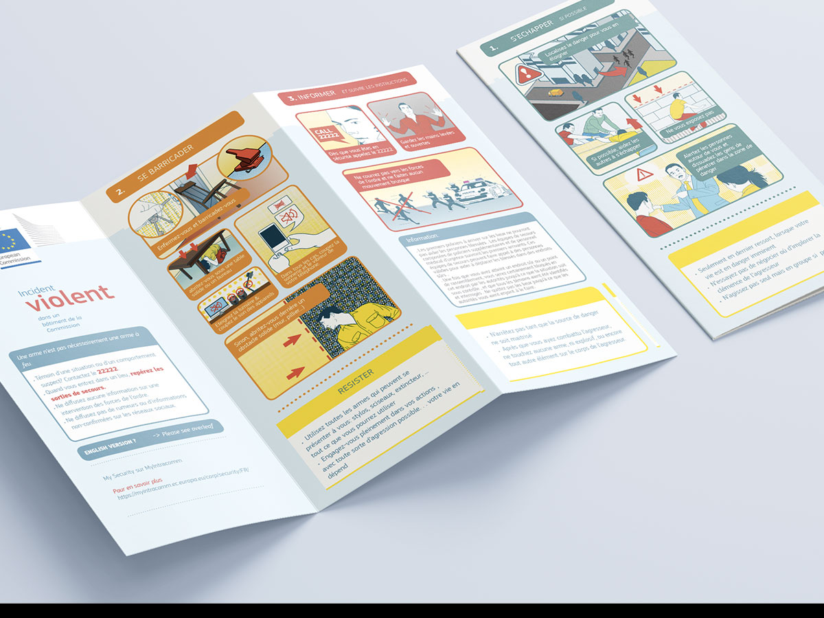
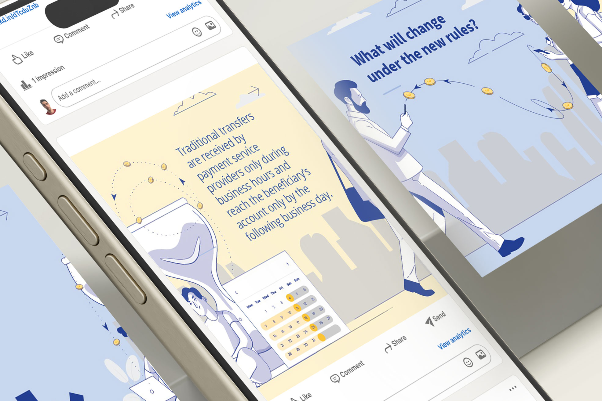
Amok is an illustrated informational project designed to communicate emergency response procedures through a clear and accessible visual language inspired by airline safety instruction cards. Communicating emergency behaviour protocols requires a careful balance between clarity and sensitivity. The challenge was to design a communication system capable of conveying serious safety instructions, remaining visually understandable under stress and avoiding unnecessarily alarming or agressive visual treatment. The brochure also needed to function across multilingual and multicultural environments where visual comprehension plays a critical role.
01
Graphic design
Adobe Photoshop
02
Illustration
Adobe Illustrator
03
Print
Adobe Indesign
04
Vectors
Graphic artwork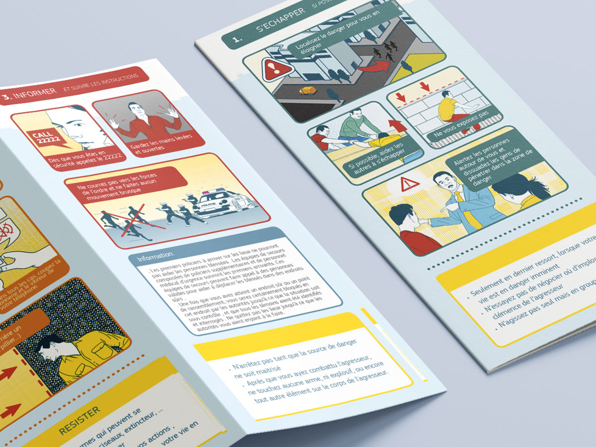
Approach
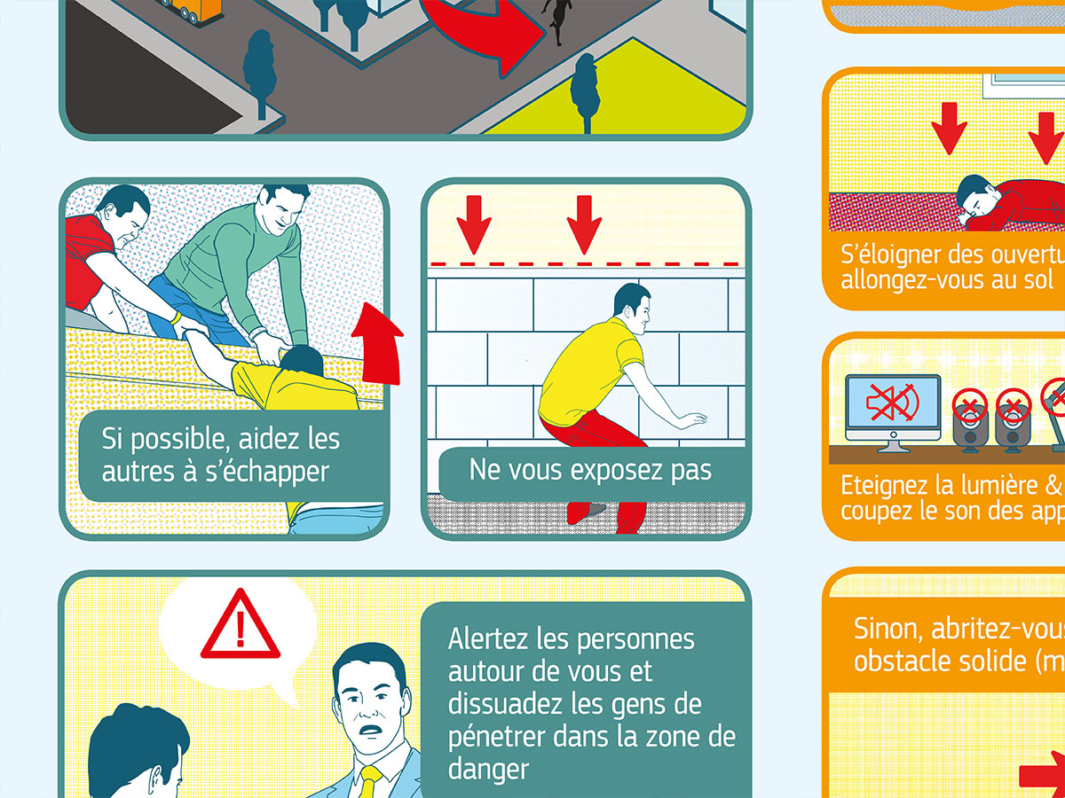
The visual direction was inspired by the simplified instructional logic of airline emergency cards, using clean vector illustrations and sequential visual storytelling to communicate behavioural guidance efficiently. The system focused on minimal and universally understandable illustrations, clear action sequences, strong visual hierarchy, simplified character representation and intuitive iconography communication. Special attention was given to readability, emotional neutrality and rapid visual comprehension in high-stress contexts. The trifold format was designed to support both portability and quick consultation while maintaining a structured narrative flow across the different emergency scenarios.
Charter
Color scheme
The graphic charter of the European Commission to be applied as recognisable, with a pre-defined style for the dedicated topic (colours) and print media displays.
-
Light Blues
#cad8ec -
Orange
#dd782a -
Turquoise
#619bb3 -
Red
#ed3b02
Thank you for watching.
Portfolio
Related portfolio items.
Check out some similar projects.

Interested in a collaboration?
Let's shape your next visual story.
Available for freelance collaborations, new projects and creative partnerships.