Challenge
Case study
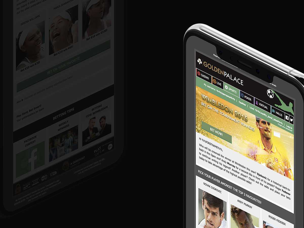
The campaign required visually impactful email designs capable of balancing promotional content, sports imagery and readability across desktop and mobile devices. Maintaining consistency while adapting multiple campaign variations was also a key requirement.
01
Emailing
Design/integration
02
Web design
UI/UX
03
Retouche
Adobe Photoshop
04
Media queries
Adaptive design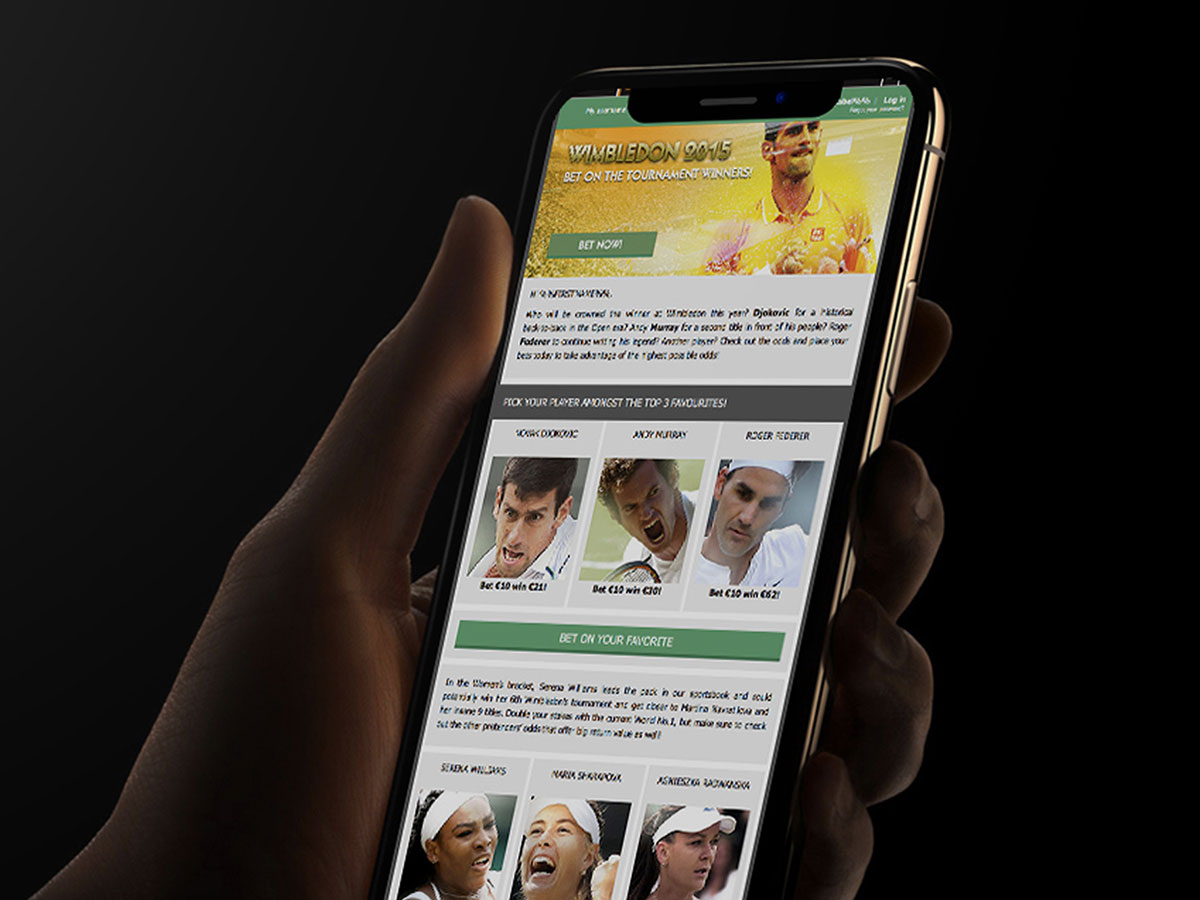
Approach
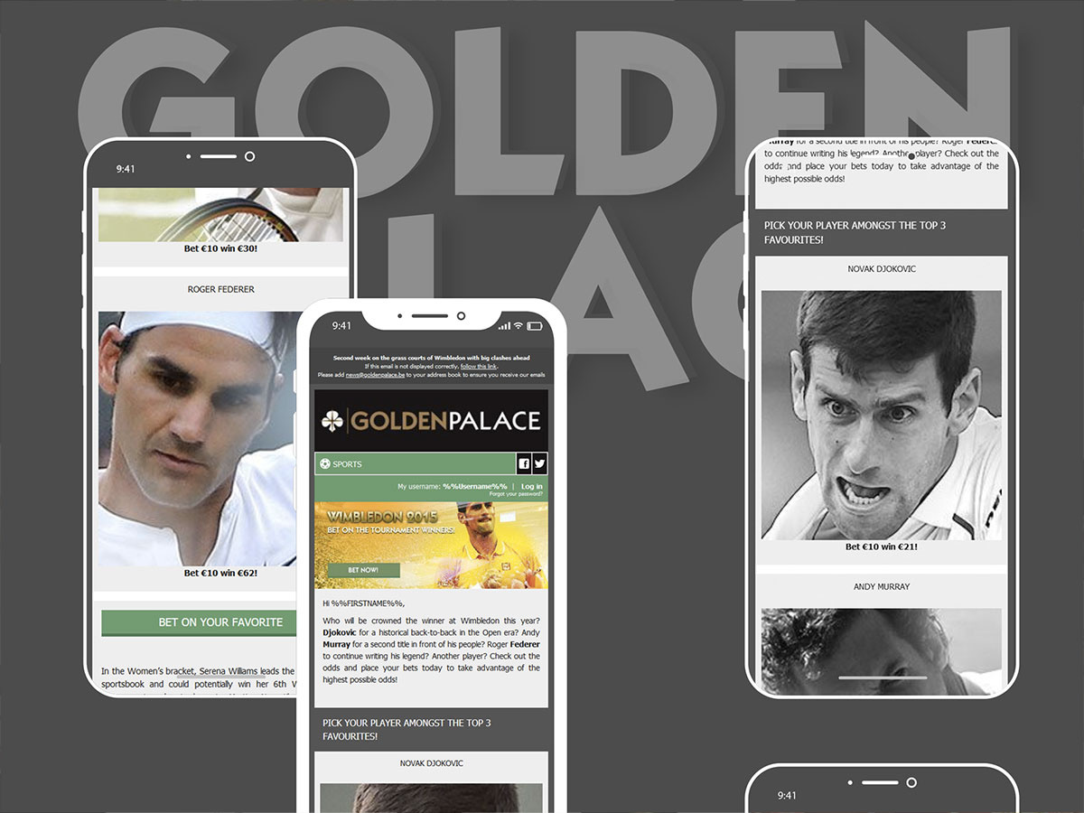
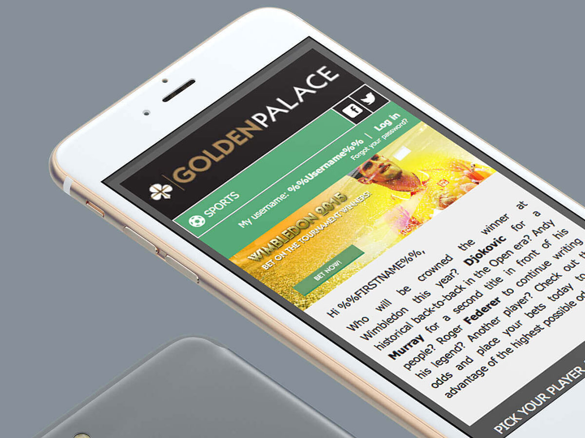
The design direction focused on expressive sports-inspired visuals, dynamic compositions and strong typographic hierarchy to reflect the prestige and intensity of the Wimbledon tournament. The layouts was integrated through Silverpop, allowing personal messages based on the user's profile, and were optimised for email integration and responsive reading experiences.
Results, outcome
The final campaign delivered a consistent and adaptable emailing system designed to support recurring promotional operations while enhancing visual impact and user engagement.
Charter
Color scheme
General charter palette of Golden palace casinos, and bright spot colors contrasted with the dark renderer of GP website for the image treatment to attract visually, by contrast, on browse. Each sub-category of the activities of the casinos on the website (online games, sports-betting etc ...) had its own specific color to be applied to the stylings, and was therefore applied to the dedicated newsletters styles.
-
Mint
#56a474 -
Ocre
#b18f46 -
Black
#000000 -
White
#ffffff
Thank you for watching.
Portfolio
Related portfolio items.
Check out some similar projects.
Interested in a collaboration?
Let's shape your next visual story.
Available for freelance collaborations, new projects and creative partnerships.